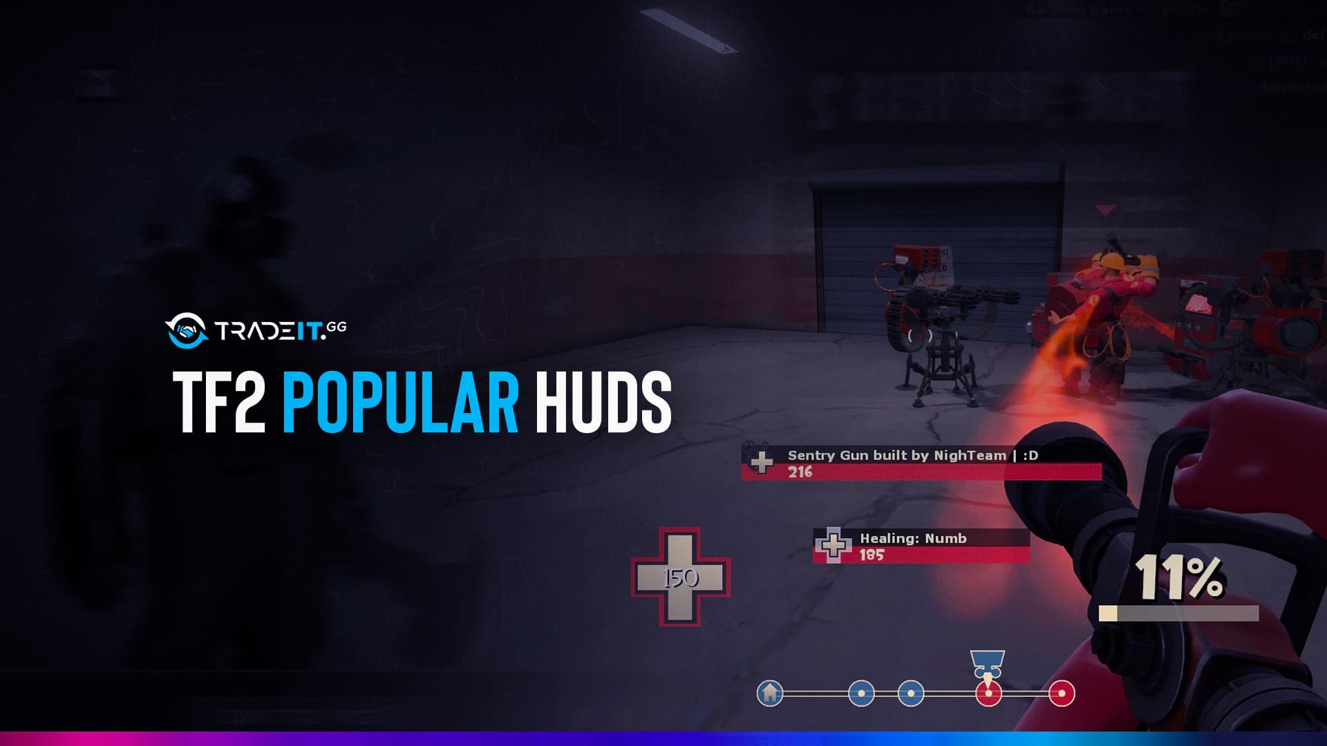
Many devoted or even casual gamers of Team Fortress 2 say the game feels like their home. There comes a moment, though, when playing tf2, you feel the want to redesign your home or, in this case, your game in some way. TF2 hud settings are actually not very effective. And the majority of players try to personalize their HUD completely. To improve your TF2 hud experience, you can employ different custom huds. It is entirely up to user preferences and satisfaction. So, if you want to change your team fortress 2 huds, you can also check our guide on how to install tf2 huds.
Here we provide you some unique heads-up displays (custom hud). And their details that look fantastic and could be helpful while you play. Because there are a plethora of choices for customizing how your title screen and gameplay appear.
If you’re ready to begin, let’s take a brief look at the tf2 popular huds.
1. TF2 | PVHUDS
The community’s most widely used HUD mod by a wide margin is PVHUD. It won’t take long for someone to divert your attention to this little fellow if you bring up user-created HUDs on a Steam forum. PVHUD is all about immediate feedback; the elements are pushed to the center of the screen, made significant and straightforward, and tell you how it is.
Ability, health, and ammo are all in the middle. Although the numbers appear a little bigger, that is only done to save you time. As you pay attention to the opponents onscreen, your peripheral vision can maintain track of your metrics.
The game of PVHUD is straightforward and substantial. It is popular because of this.
2. TF2 | Budhud
While we were discussing minimalist HUDs, this is the supreme example of minimalism. The BroeselHUD strikes a beautiful mix between having an instantly recognizable structure and being kept to a minimum to minimize distractions. The character portraits are removed from the health bar, and the components are moved to the bottom of the crosshair in the center of the screen. More of the screen may be used to view the game because the icons are smaller than those in PVHUD.
Additionally, it adheres to a different idea, positioning the elements of the screen system more to the side than the center. Budhud is excellent if you like having the most precise possible view when you play. You won’t get sidetracked because it is so uncomplicated and sparse.
3. TF2 | FlawHUD
We reach, without a doubt, one of the best custom HUDs available. If Team Fortress 2 ever had an official dark mode-style HUD, one can only hope it would look as unique as FlawHUD. This HUD is perfect, despite what the name would imply. This dark-themed HUD offers a minimalist approach for players searching for utilitarian designs that don’t compromise its attractive appearance, with fantastical-looking loading screens and menus. The screen will still look recognizable while playing the game, but all the UI elements are positioned such that you can view more of the action while still having access to the information you need.
FlawHUD is ideal for both gamers looking to improve their game and those who want a new, lovely appearance because it has features like the ability to enable custom crosshair and a streamer mode. FlawHUD is regarded as one of the best custom HUDs available thanks to the excellent arrangement of the UI elements to enjoy the game in a non-intrusive style and its amazingly well-designed dark-themed appearance.
4. TF2 | Oxide Hud
If you want to have a competitive advantage, use Oxide as your HUD. The HUD will only contain the necessary thanks to the patch. For TF2 players who are competitive and only require the bare minimum, Oxide is a HUD. There are fewer menu options and icons overall. Because of this, gamers can see everything around them on a virtually empty screen.
Almost nothing else is present on the menus other than basic listings. Small, discreet icons are used to represent health, ammo, and unique ability. There’s hardly anything left of the who-killed-who blog. Even the menus are just a list of items in hell. Oxide tf2 popular hud is the finest option if you’re concerned with winning.
5. TF2 | Improved Default Hud
Many players have grown acclimated to the default HUD and UI, so changing them would be equivalent to changing the game itself. However, just because you’ve had a crooked picture your entire life doesn’t mean it’s a bad idea to straighten it out a bit. Although this HUD initially appears to be the same, there have been significant quality adjustments. The main menu, in-game scoreboards, and loadout displays have all been updated while retaining their original spirit. You’ll adore what this HUD delivers with more apparent gameplay UI components and enhancements (like Medic’s uber charge meter, which is more straightforward to keep track of) without sacrificing the game’s distinctive appearance.
Improved Default Hud is a fantastic HUD that improves the visual appeal of the game without sacrificing the beloved elements. It takes only a few small but significant improvements that keep the game familiar but still important.
Conclusion:
Here is our guide to the tf2 popular huds. Due to its recognizable appearance, Team Fortress 2 has remained a classic of our time for almost 15 years. But players and fashions change over time, so in addition to the countless memes and other works created by the community, custom HUDs have advanced significantly. There are numerous options for bespoke HUDs available. These most popular huds have a lot in common in terms of making the game appear nicer and cleaner while also effectively displaying the information you need. All of these HUDs are accessible through huds.tf.


