The last several years marked a new era of branding across the esports scene. As teams adapt to modern audiences, higher production values, and global recognition, logos have become a key part of competitive identity.
In this article, we compare old and new CS2-era logos, focusing on how visual branding has evolved and what it means for teams and fans alike.
Why CS2 Teams Change Their Logos
Esports logos are no longer just symbols for jerseys. They are full-scale brand assets. With CS2 pushing a cleaner, more modern visual style, many teams updated their logos to stay relevant and adaptable across platforms.
Modern logos need to work everywhere: in-game overlays, social media avatars, merchandise, and large-scale broadcasts.
As teams grow from grassroots organizations into global esports brands, they refine their identity to appear more professional and timeless.
Simpler shapes, stronger contrast, and scalable designs help logos remain recognizable at any size.
Rebranding often aligns with roster changes, anniversaries, or entry into new esports titles, making CS2 a natural moment for visual refreshes.
Old CS2 Logos
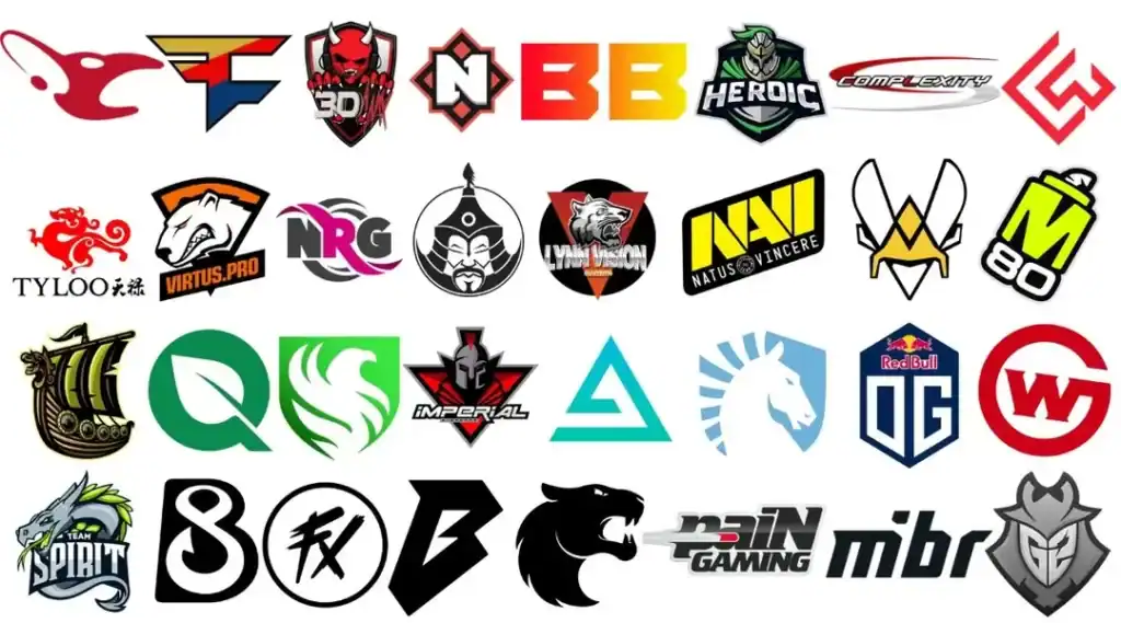
Older CS-era logos often reflected the early esports aesthetic: busy designs, sharp edges, and heavy symbolism. While iconic, many of these logos were not optimized for modern digital use.
Just take a look at the old logos of 3 famous CS2 teams:
The classic FaZe logo is one of the most recognizable in esports history. Its angular, graffiti-inspired design fit the team’s rebellious image, but could appear overly complex at smaller sizes.
Earlier versions of Team Spirit’s logo featured intricate dragon details. While visually striking, the complexity made it harder to reproduce consistently across different media.
Formerly mousesports, older logos leaned heavily into literal imagery. The detailed mouse icon worked well on banners but struggled in clean, minimal UI environments.
These older designs carried strong identity, but they weren’t always flexible enough for today’s branding needs.
New CS2 Logos
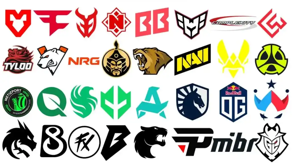
The CS2 era has pushed teams toward cleaner, more refined branding, without losing identity.
FaZe Clan retained its iconic symbol but refined proportions and spacing, making the logo sharper and more adaptable for digital overlays and merchandise.
Team Spirit simplified its dragon emblem, focusing on bold shapes and symmetry. The result is a logo that feels powerful yet modern, especially in broadcast graphics.
MOUZ embraced minimalism, transforming the mouse concept into a sleek, abstract mark that scales perfectly across all platforms.
These newer logos prioritize clarity, versatility, and longevity, key traits in an increasingly commercial esports landscape.
Conclusion
The transformation of CS2 logo designs reflects how esports brands are maturing. Old logos built recognition and legacy, while new logos emphasize clarity, adaptability, and professionalism.
Teams like FaZe Clan, Team Spirit, and MOUZ show that successful rebranding doesn’t erase history. It refines it.
FAQs
Why do esports teams redesign their logos so often?
To stay modern, scalable, and relevant across digital platforms.
Do logo changes affect fan loyalty?
Usually not. If done well, they strengthen brand recognition.
Are simpler logos better for esports?
Yes, especially for visibility in streams, social media, and merchandise.
Did CS2 force teams to rebrand?
Not directly, but it encouraged modernization across the scene.
Will more CS2 teams change logos in the future?
Very likely, as branding trends and platforms continue to evolve.


